Walk through Florence and you are walking through two stones. The grey one, cool and calm, frames the doorways, lines the courtyards of Brunelleschi and Michelangelo, and carries the quiet authority of the Renaissance interior. The gold one, warmer and harder, builds the walls of the palazzi and shoulders the load. They are Pietra Serena and Pietra Forte Fiorentina, the two great Tuscan sandstones, and they are constantly confused.
The confusion is understandable and worth clearing up, because they do genuinely different jobs. We source both at the block, so here is the honest comparison: what each is, how they differ, and where each belongs.
The same city, different roles
Both stones come from the hills around Florence, and both are sandstones, which matters more than any single visual difference. Being silica-based, neither etches with acid, the failure mode that troubles the region's marbles. But within that shared family they diverged, historically and physically, into two distinct roles.
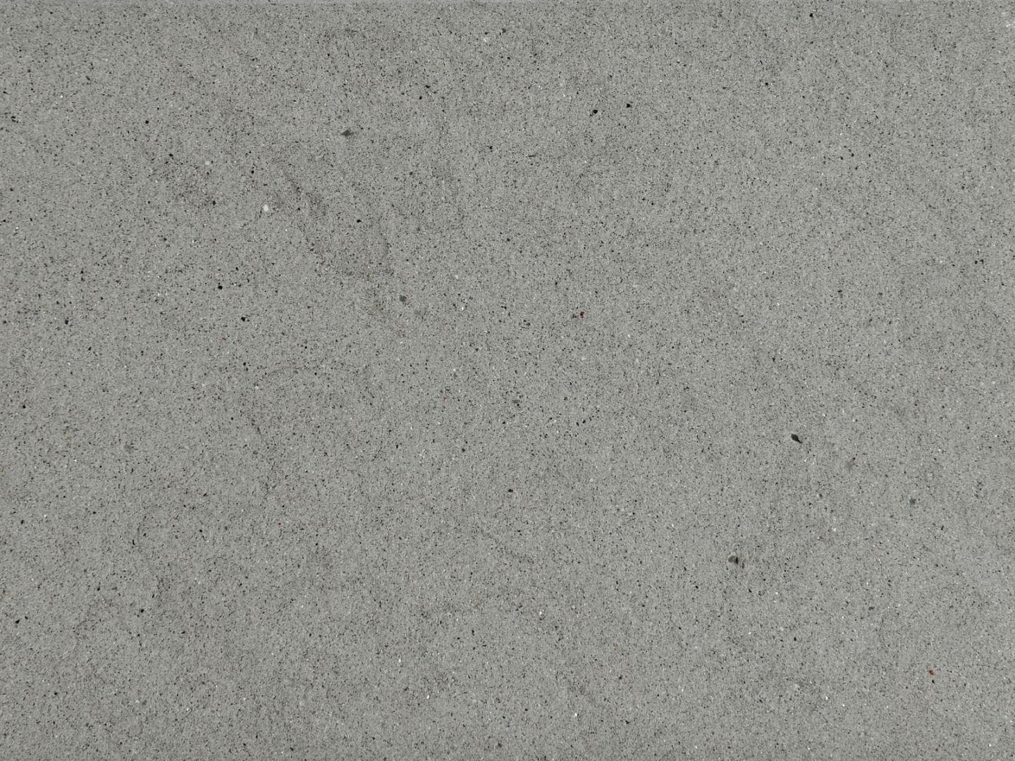
Pietra Serena is the decorative and detailing stone. Its name suggests serenity, and that is the right word: a calm, even blue-grey, finer in grain and softer in the hand. Renaissance Florence used it for what the eye lingers on, columns, pilasters, door and window surrounds, staircases, and floors. It is the stone of the interior, understated and architectural.
Pietra Forte Fiorentina is the structural stone. Forte means strong, and that too is literal: a warmer golden-brown, denser and harder, the load-bearing stone of the city's great houses. Where Serena decorates, Forte builds. It is tougher, more weather-resistant, and historically the workhorse of Florentine construction.
Same family, same city, opposite jobs. That is the heart of the distinction.
Colour and character
The most immediate difference is colour, and it sends the two stones to different palettes.
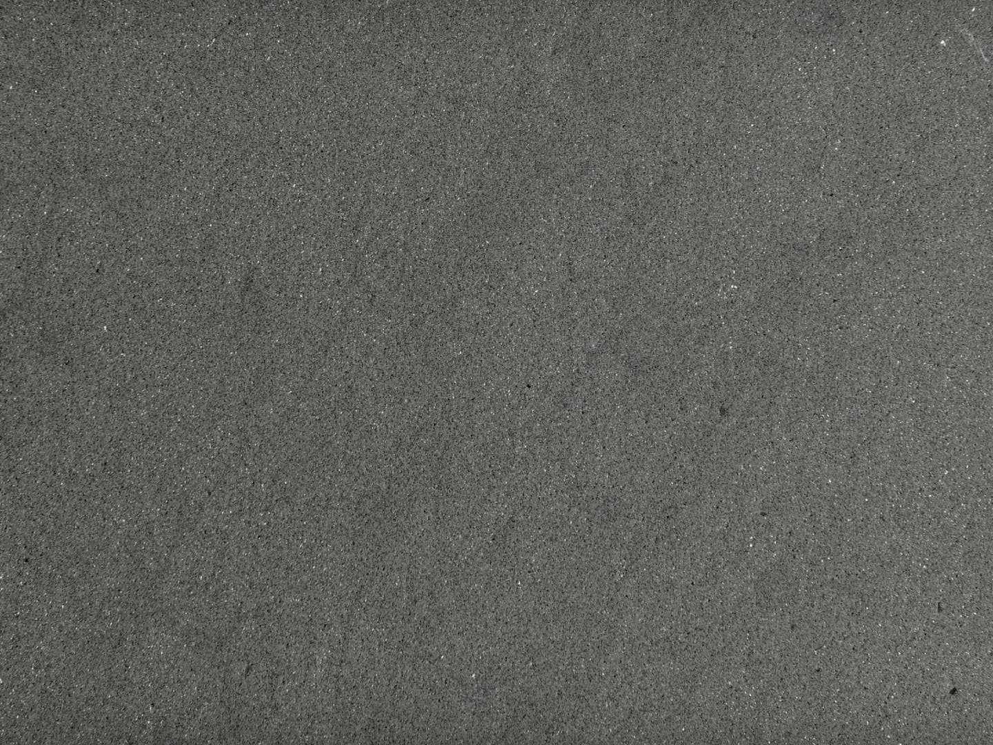
Pietra Serena is a cool, even blue-grey, calm and quietly grey without drama. It reads contemporary and timeless at once, which is why it moves so easily between a Renaissance courtyard and a modern minimal interior. It sits beautifully with white plaster, pale timber, and cool palettes, and it is the more restrained, more architectural of the two.
Pietra Forte Fiorentina is a warm golden-brown, richer and more characterful, with the earthy depth of a stone that has weathered on Florentine facades for five hundred years. It reads warmer, more traditional, more robust. It belongs with warm palettes, with bronze and timber, and with schemes that want the honesty of a structural stone rather than the calm of a decorative one.
Grey and gentle against gold and strong. If your scheme is cool and quiet, Serena; if it is warm and grounded, Forte.
Density and durability
This is where the historical roles show up in the technical picture, and where selection matters.
Pietra Forte is the denser, harder stone, which is precisely why Florence built with it. It carries better abrasion resistance and better weathering, making it the stronger candidate for exterior cladding, paving, and heavy-duty floors. It is the more forgiving of the two under real load.
Pietra Serena is finer and softer. That fineness is its beauty, giving crisp detailing and a smooth even face, but it means a busy or heavy-duty floor wants either a denser selection or a textured finish to earn its keep. For interior floors, stairs, and detailing it is superb; for the most punishing exterior or commercial use, Forte or a carefully selected dense Serena is the safer specification.
As with every natural stone, the specific block governs the numbers. Category averages are for shortlisting; a reservation with test data, water absorption, flexural strength, and frost resistance, is for building. This matters most for exterior work, where the frost-resistance of the actual bed is the number that counts.
The shared advantage: no etching
Both stones share the defining benefit of the sandstone family. Because they are silica-based rather than calcite-based, acids do not react with them. Wine, citrus, vinegar, and most cleaning products that would leave a dull etch on a marble simply do not mark them chemically.
For a specifier, this is significant. A Tuscan sandstone floor in a kitchen, a bar, or a busy public space survives contact that would slowly ruin a marble. Both stones will stain if left unsealed, so sealing and pH-neutral cleaning are specified, but the etching worry that governs marble specification is off the table. This is the reason to reach for either of these stones over a grey marble when durability and acid contact are real concerns.
Finishes and where they belong
Both are matte, natural stones, and the finish tunes them to the application.
Honed is the interior default for both: smooth and even, showing Serena's calm grey or Forte's warm gold at its best on floors, stairs, and cladding.
Brushed and bush-hammered add grip and texture for wet areas, terraces, and exterior paving, and suit Forte's robust character particularly well.
Sawn and sandblasted give an understated, civic surface for traditional and heavy-duty work, the finishes you see on historic Florentine stone.
Neither takes a high marble polish, and neither should. Their appeal is the natural matte character of sandstone. For the full finish logic, see our honed vs flamed vs brushed guide.
How to choose
Work from the job and the palette:
Cool, calm, grey scheme; interior floors, stairs, detailing? Pietra Serena.
Warm, grounded scheme; exterior cladding, paving, heavy-duty floors? Pietra Forte Fiorentina.
Need the toughest, most weather-resistant option? Pietra Forte, or a dense Serena selection with test data.
Need a grey that will not etch in a kitchen or busy floor? Pietra Serena, or the more contemporary Mars Grey if you want a veinless modern grey.
Both are part of the wider Italian stone story; for the full picture across marble, limestone, and sandstone, see our Italian stone guide.
Sampling the two
The difference between Serena's grey and Forte's gold is obvious in the flesh and easy to misjudge from a photo, and both shift under different light. So specify from decent-sized physical samples, in your intended finish, viewed in the actual light of the space. Grey especially plays tricks between daylight and interior lighting.
If you are choosing between the two Tuscan sandstones, or weighing them against a marble or a Portuguese limestone, start a project brief and we will source the right stone, bed, and finish for your application, with honest guidance on where each belongs. Or request samples of both and set the grey against the gold in your own light.